Design System design
2019 – 2020
Creation and curation of a design system for internal production tools and services.
DESIGN SYSTEM FOR INTERNAL TOOLS (2019/20)
Creative lead & content curator
I The challenge
From the challenges I faced when designing for internal tooling products (globally distributed team, many stakeholders and product requests, trying to keep the UX in sync - more on this here), arose the necessity of a collection of components and design guidelines. With quick turnaround needs, requirements that could change on a weekly basis, new and dropped requests, and all the other wonderful circumstances a designer in an R&D tooling environment deals with, a systematic, robust and reusable design approach was the only option to not lose our minds.
The first problem that had to be solved was an organizational one: convincing the development team to invest time to update existing internal products in order to have a standardized set of components that are in sync with a new design system. Investing time now to reap the benefits later is an unusually hard sell in a fast moving internal development area. Eventually, however, the pitch to engineering and product management leadership was successful.
Using some of my spare time and wanting to get more familiar with Adobe XD, I decided to put together a design system and documentation containing and expanding upon the work my team and I had done so far.
II The journey
Judging from what feels like 80% of all recent talks and seminars at design conferences I attended, everyone working in the field should be familiar with design systems and the need for them, especially in a company with a large product portfolio.
A digital evolution of traditional style guides, design systems contain not only guidelines on the visual language, but also the interactive building blocks needed to create user interfaces. It's basically an assortment of components that makes designing products really fast with an almost guaranteed alignment to spec and style.
A solid design system, once established, running and in sync with development, lets a designer focus on solving the more pressing issues of a product - the user experience.
The research part was very straightforward: thanks to companies like IBM, Google, Salesforce, and Adobe, extracting the building blocks of a design system was fairly simple.
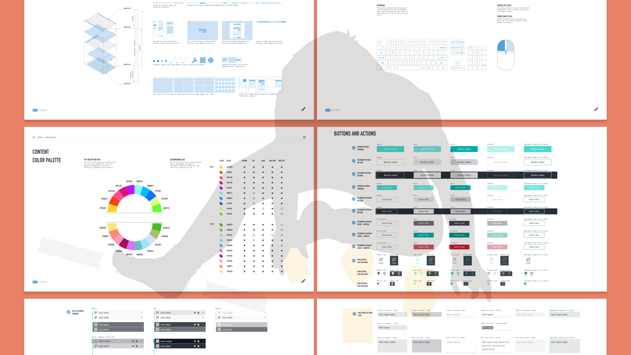
As a result, let me introduce the design system I ended up putting together for our internal purposes: Toolbox.
Of course Toolbox contained a multitude of components and states, but they are not the only part of it, nor do I think they are the most essential. I believe that a good design system should work as an educational instrument to be used as a primer for anyone joining the team that's using it. The actual components can’t be the starting point, but must reflect the thought process and the design philosophy of the system they were created for.
For this to work it must contain more than the results of our thinking: it must also show the rationale behind it if the goal is for people to use it and help it grow. Knowing the “why” usually makes things more clear, and own-able.
One of the requirements for the design was to be functional, modular, and adaptable to allow for faster development turnaround. Toolbox reflected this with guidelines focused on efficiency, productivity, and pragmatism without ever, and this had to be emphasized, compromising the usability or quality of life of the end user.
Toolbox contained sections on the system architecture, the framework, and the general composition of the user interface. The UI itself is documented via theme, grid, colors, fonts, and iconography (the traditional style guide part). Lastly, the documentation included interaction guidelines and principles that informed, on a higher level, how the experience should "feel", how end users operate, and how mouse and keyboard commands are designed.
In terms of components, the system closely followed the Atomic Design principles of Brad Frost, where every larger element of a UI consists of smaller pieces; buttons and text inputs combine to online forms, online forms and top bar to pages, etc.
Each atomic component contained multiple states (where applicable), often the usual “regular-highlight-active-disabled”; in some cases I experimented with using states for visual variations, but I’m not 100% sure yet that this is a viable use case in the long run.
III The takeaway
After introducing the system to the design team and working with them to tweak and improve it, the time it took to create design mockups decreased dramatically, and we rarely have discussions now about misalignments.
It allowed us to put more time into talking about the workflow, the user experience, and the usability of our product. While there are a lot of things I'd like to improve in our current Toolbox (for example a whole section about accessibility), I'm glad it had a positive impact on our work, the user experience, and productivity.
From designing the system itself, I've learned that it's important to keep a delicate balance between adding and editing content. As each component can have multiple states and variations, keeping it consistent with all other components is a more taxing job the larger the library gets. Once the system opens up to invite others to contribute, it can get very large, very quickly, requiring a more pragmatic and sometimes draconic approach to curation of the system and the applications built from it. A product informs the system, and the system directs the product.


